Wello

- Founder, Product Designer
- Wellness app
- 2024 to now
- Figma, Design system, Mobile UI
01.1
Overview
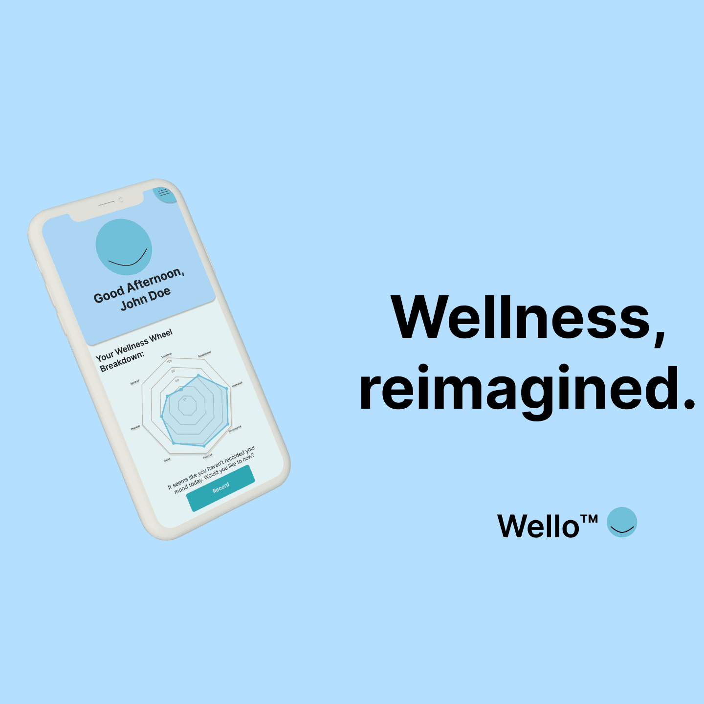
Wellness app built around helping someone understand how they're doing and take one manageable next step, instead of generic wellness-library fatigue.
01.2
Detail
Designed a reusable Figma system: category tokens, time-based palettes, and a cohesive mobile UI.
Current milestone: a Guided Check-In flow — check in → understand the moment → choose a personalized micro-action → follow up — deliberately rules-based rather than open-ended AI counseling.
“Headspace meets playful digital minimalism.”
01.3
History
It started in eighth-grade health class, with the Wellness Wheel on the board, and got drawn over winter break on my grandma's couch. The name has changed since and the product has been rebuilt, but the line on the first poster is still the line.
- Sky73C7E3
- LinenFFF9F0
- Turquoise24B0BA
- LightF0F2F2
- Navy2E4A70
- GoldCF8A40