02 / 04
Case study

Reckless Studios

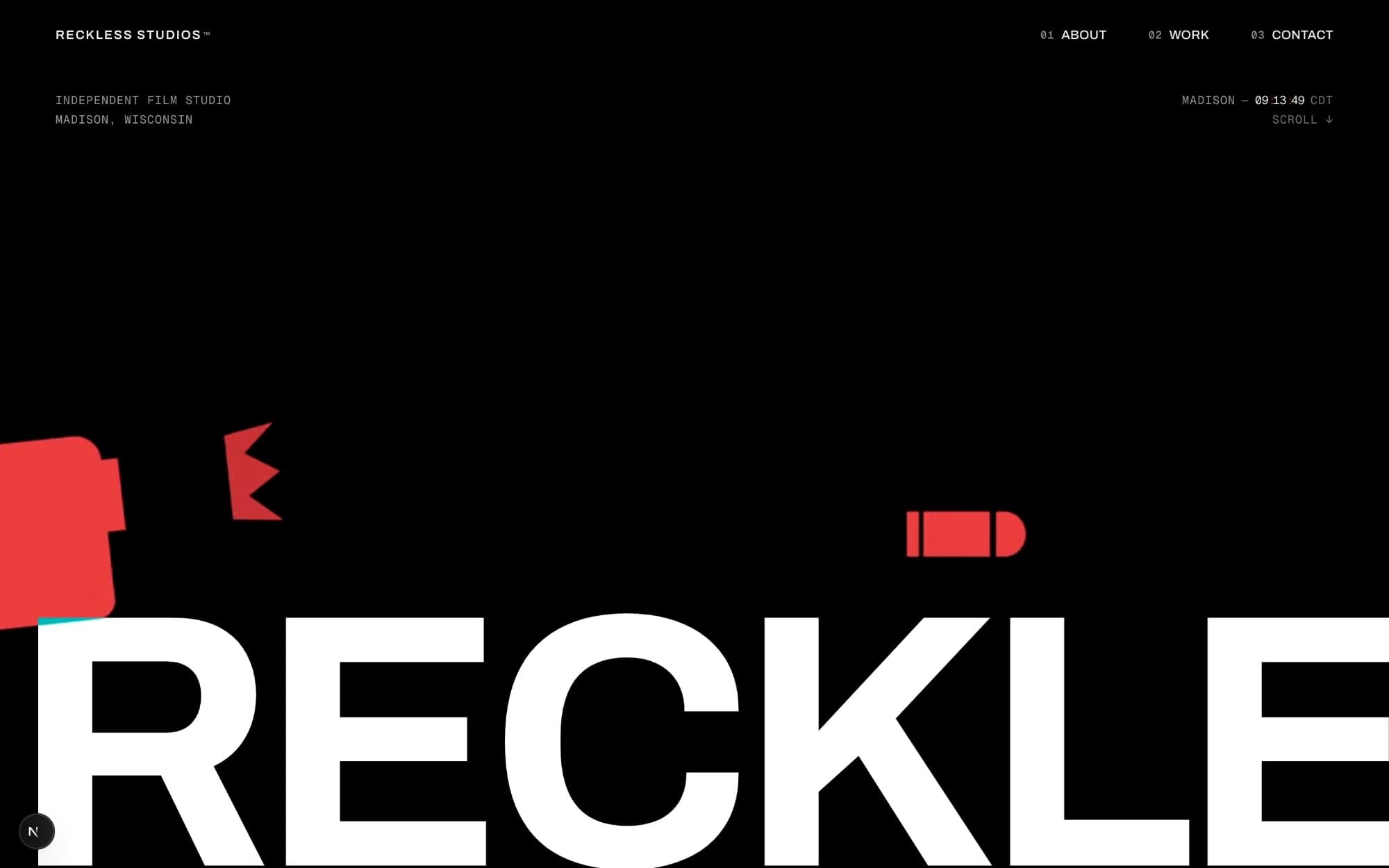
Homepage hero, the studio wordmark set full-bleed on black
Fig. 02.1Homepage hero, the studio wordmark set full-bleed on black
Role
Web Developer, Designer
Context
Client site, Madison
Years
Since 2024
Stack
Responsive web, Design + development

02.1
Overview

Client site for an independent Madison film studio positioned around risk and ambition (“We don't play it safe”).

02.2
Detail

Designed and developed a responsive site translating that identity into a bold, cinematic direction — dark neutrals, warm white, one bold accent, grain, fades, spotlight-style interactions, portfolio-forward layout.

Live client relationship, 2024 – present.

02.3
History

The identity arrived as a pencil drawing. I took it to vector first, then drew it again for social, where a circle full of detail stops being readable at avatar size.
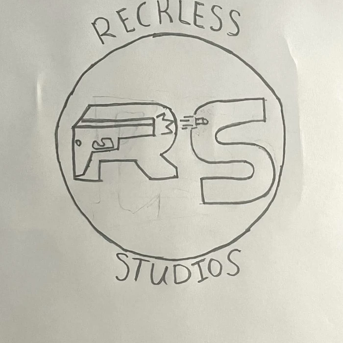

  1. 01Pencil on paperDraft #2
    The original Reckless Studios logo, drawn in pencil on printer paper

    The mark as it was first drawn: RS locked inside a ring, a pistol cutting across the R, the name curved around the circle.

  2. 02Vector
    The Reckless Studios mark redrawn as vector art: black RS on a white disc, red pistol

    Redrawn digitally, proportions held. The pistol and its muzzle flash take the one accent color; everything else is black on a white disc.

  3. 03Social refresh
    The refreshed Reckless Studios mark: RKLS set in four black, white, red and teal quadrants

    Rebuilt for profile pictures: RKLS across four quadrants, red and teal against black and white, with nothing left that a thumbnail could swallow.

Motion
DaVinci Resolve